I'm Sharon. I'm new here, and new to blogging, so bear with me.
I don't usually write much about my work or myself, yet I was kindly invited here and I'll try to do my best. Some of you may already know me from Facebook or perhaps my website, but for those who don't here's the short version:
I lived most of my life in rural England, surrounded by nature in all its forms. I loved rainy days and sunny days alike, wandering in fields looking for 'treasures' - usually an interesting pebble or bit of wood. Sometimes, if I was lucky I would find a rabbit skull (I had quite a collection of these), and once I found a flint arrowhead.
I started dabbling with watercolours from my early teens. First copying works and then drawing from photos or from nature. I eventually went to art college, and then to University to follow a fine arts degree. I hated every minute of it.
For a start no one was interested in such a traditional and 'boring' medium as watercolour. Acrylics were the big thing and everyone wanted to be the next Damien Hirst* - that is; someone who is at least as adept at talking about their work as they are actually producing it, and if the talk became bigger than the art then so much the better! (Yes I have a bee in my bonnet about such things!)
I gave up after two miserable years and got married, had kids, got divorced, got depressed, moved to Edinburgh and tried to commit suicide. I was not in a happy place, mentally speaking.
Then one day while visiting the Royal Botanic Gardens Edinburgh (RBGE) I picked up a leaflet advertising their Diploma in Botanical Illustration. I applied and was accepted, and I have never looked back since. The course changed my life completely.
My depression lifted, slowly but surely. I met a new partner who supports my new career completely, and I'm now painting like never before. On top of this I have also discovered that I love to teach. I now teach on the RBGE's Distance Learning Diploma in Botanical Illustration and I'll be teaching on the Certificate in Botanical Illustration intensive course during the summer. I also teach at least one short course each year at the Botanics - the last one was 'Complex Forms' and the next will be 'Garden Visitors' (date TBC).
I also give one-to-one 'Skype' tutelage, which gives me great flexibility as I can work from home and fit my painting and my lessons around each other.
*A man who famously pickled a bull, but who had no idea who or what a Minotaur is.
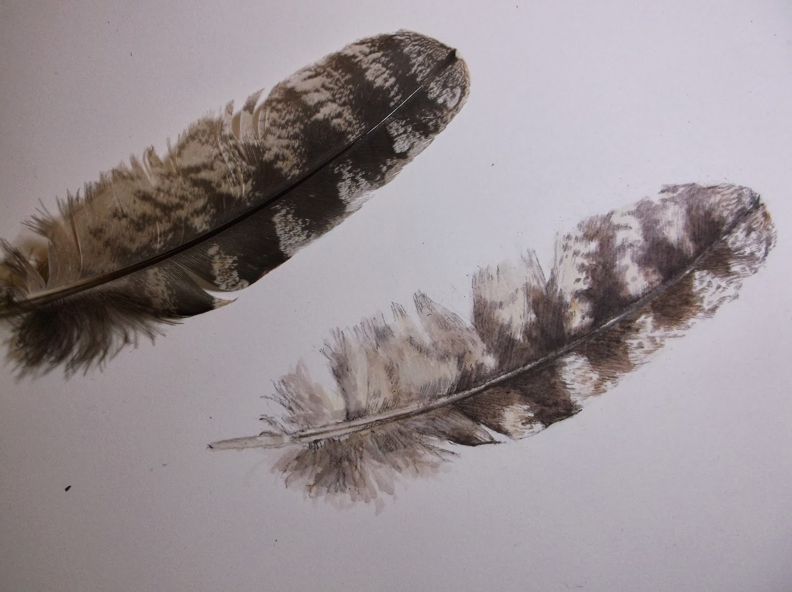
Thank you for being so patient through that, here's some actual work (sorry about the quality these were photos rather than scans):
The beginnings: Here I have started a Barn Owl, a beautiful bird which is becoming increasingly rare. First I transferred my drawing onto the Fabriano 5 using tracing paper. Then I lightly went over all the outlines in appropriate colours of paint, then I removed the pencil with a soft putty eraser. I started blocking in the eye, as with all paintings of living creatures it is immensely important that they eye is right. If it is then other things can be wrong with the painting and it'll still look ok, but if the eye is wrong then the painting will never look any good and you may as well start again. Nearly all of the animal's character is conveyed through the eye.
I started then to add some very light washes to define the basic areas of tone. I used Raw Umber for the upper body colour - an excellent match for the Barn Owl start from the tube. The white areas I started to define with a mix of Payne's Grey and Sepia.
Here a little more definition is going in. I've blocked in the beak with a Permanent Rose, mixed with a little of the Raw Umber and some Burnt Sienna. I'm starting to figure out how to lay down the complex markings on the wing - a series of dots and larger areas of Sepia and Payne's Grey.
The same pink mix here going in on the feet, more definition on the beak and expanding the areas of detail.
A heavier wash of Raw Umber over the back which is helping to define the shape of the bird much more. The talons have been started and the tail is getting more defined.
Feet and talons taking shape. These are also important points on any bird and care should be taken over them. The shadowing on the underside is getting much deeper and there is more definition to the face.
More markings on the wing.
A series of little speckles across the entire back and running down onto the wing - this is the basis (the underpainting if you will) for the markings across the back. This look horribly complicated, but if you build up in thin layers of paint then it's actually fairly simple.
Finally finished. I added to the grey markings and defined the larger more obvious markings as well. The dark areas were a mix of Payne's Grey and Sepia, and some of the little oval markings has a wee dab of White Gouache added to them. I made the feet greyer and put more shadow and definition on the tail area.
The whole thing took something like 10 hours altogether, spread over several days.
List of paints used:
Raw Umber
Sepia
Payne's Grey
Permanent Rose
Burnt Sienna (only a little here and there)
I used a NO.4 W&N Series 7 miniature for all the washes
and a NO.2 W&N Series 7 miniature for the rest.
Thank you for reading this far, I hope it wasn't too tedious. :)


